Case 02 · OPPO Find N3 Flip · Mar—Aug 2023
From cards to an extensible cover-screen system.
The next generation of flip phones needed broader app support, but the previous standalone-card framework could not scale cleanly. As project design lead, I proposed a new cover-screen framework, led problem framing, five responsibility-based system spaces, core interactions, and key trade-offs, and coordinated delivery with product, engineering, visual, motion, and business teams responsible for cover-screen lock-screen widgets.



- Role
- Project Design Lead
- Timeline
- Mar—Aug 2023
- I led
- Problem framing · Strategy · Architecture · Interaction model · Key decisions
- Partners
- Product · Engineering · Visual · Motion · Teams responsible for cover-screen lock-screen widgets
- Scope
- Home · App Library · Mini apps · Notifications · Control Center · Layouts · Components
- Status
- Shipped with OPPO Find N3 Flip
Case chapters
Current chapterOverview01 / 10⌄
01 / Outcome
Turning a constrained screen into a system that could keep growing.
Rather than placing every capability in another isolated card, the new framework created a shared structure for apps, notifications, system controls, and personal expression.
15+ counts the teams responsible for cover-screen lock-screen widgets; 30 is the total number of shipped cover-screen components. They are separate measures.
02 / Challenge
Cards were simple—but they could not carry the next generation of the cover screen.
The team combined analysis of the existing product model with previous-generation feedback: users saw limited value and too few useful cover-screen scenarios, while the new device needed broader app support. The challenge was no longer adding cards, but creating a system that could keep growing.
Limited display quality
Relatively low resolution required careful control of type size, information density, and visual detail.
Small screen size
Fine-grained or complex configuration was unsuitable, so high-frequency tasks had to remain easy to reach.
Fixed orientation
The screen could not freely rotate to landscape or inverted use, so layout and interaction needed one predictable orientation.
03 / Success criteria
Do not shrink the inner screen; build one extensible and predictable structure.
We used three criteria: support more apps in one framework, reuse familiar system conventions, and give multiple integration partners shared rules for delivery.
Keep integrating through one framework
New apps enter a shared structure instead of creating a new entry model for each capability.
Reuse familiar system conventions
Selectively reuse inner-screen gestures and state relationships to reduce relearning.
Scale through shared rules
Use shared layout rules and visual specifications to align implementation across teams.
04–06 / Decisions
Three decisions turned a feature collection into a product system.
Decision 01 · Architecture
Define five system spaces by responsibility—not as a deeper linear journey.
I organised Home, mini apps, content notifications, lightweight alerts, and global controls into five responsibility-based, partly parallel system spaces, then defined the display and behaviour boundaries of each. They appear according to the task or system state rather than forming a fixed sequential journey.
Home
Time, identity, and at-a-glance information
Mini App
Actionable tasks and app content
Content notification
Rich information that may require attention
Simple notification
Lightweight, immediate feedback
Global settings
System controls that work across contexts
Decision 02 · Interaction model
One app entry. One global gesture model.
An early alternative retained cards and placed the App Library alongside them through consecutive left swipes. It preserved the previous pattern but created two competing content models. The team jointly chose an app-based system with one App Library entry for mini apps.
Swipe left from unlocked Home to the App Library; tap to open a mini app; pull down from the upper left or right for Notifications or Control Center; swipe up from the bottom to exit an app. The gestures reuse inner-screen conventions. One entry sacrifices some direct exposure but scales more predictably.
System flow
Keep the main journey simple while global controls stay within reach.
The App Library carries application growth. Notifications and Control Center behave as global overlays without replacing the current task.Global overlaysSwipe down from top leftNotification Center Swipe down from top rightControl Center Triggered by system events without breaking the taskLightweight alert
Swipe up to close an overlay and return to the prior task state
Home / Lock Screen
Time, identity, and glanceable information
App Library
One entry point for Mini Apps
Mini App
Continue a focused task
Swipe up from the bottom to exit and return to the App Library
These spaces collaborate by responsibility and are partly parallel—not a fixed hierarchy people must traverse in order.
Decision 03 · Delivery at scale
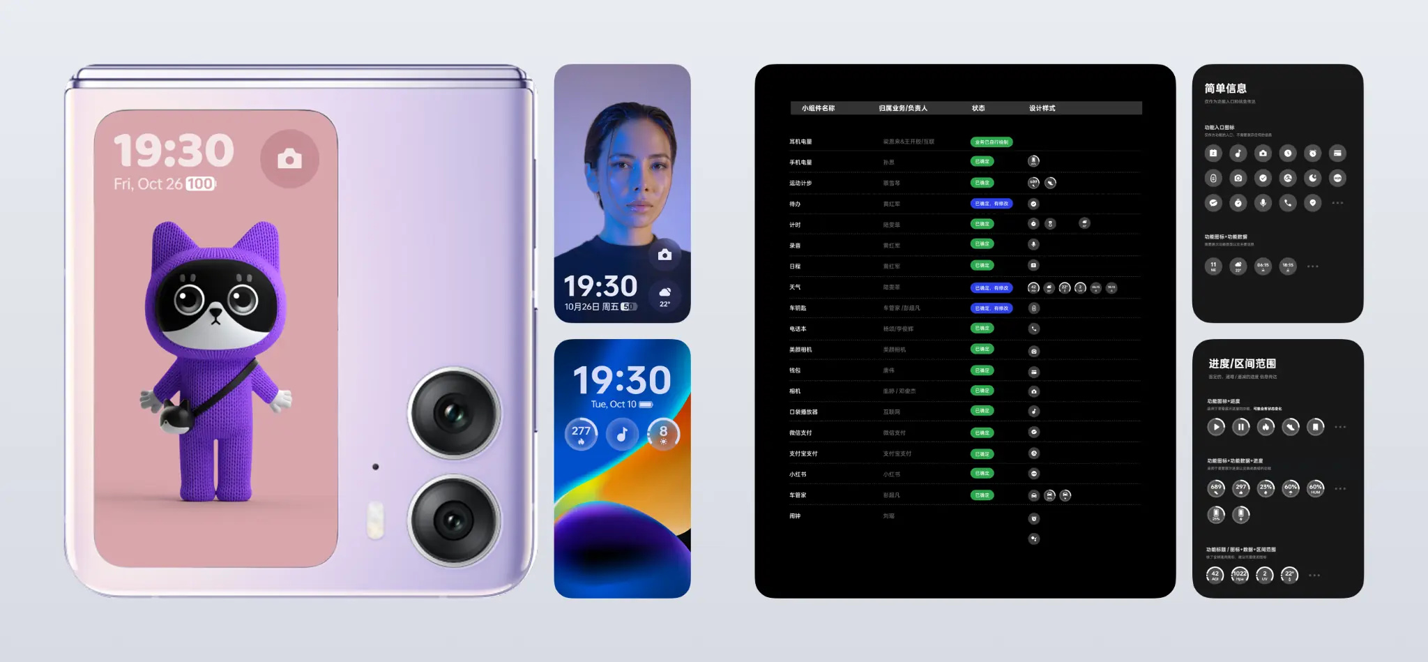
Use controlled layouts and component guidance to make expression scalable.
The three layouts were not defined mechanically by component count. They were based on how resource styles, time, and components could combine while preserving clear positioning and legibility on a small screen.
The cover-screen component specification was authored by the team’s visual designer, defining shared dimensions, styles, and states. My role was to coordinate participating app teams as they designed, built, and shipped against it.
07 / Validation & iteration
Usability testing and internal trials exposed comprehension and implementation issues early.
The project was validated through usability testing and internal trials with selected engineering partners and external core beta users. The team observed whether entry points and interactions were easy to understand, identified local usability issues introduced during implementation, and iterated the relevant details before release.
08 / Final experience
One shared system structure supported different apps and forms of expression.
The shipped experience supports fast tasks through frequent-use components while enabling expression through interactive content, portrait imagery, clocks, wallpapers, and full-screen AOD. Consistency comes from shared hierarchy and behavior—not from making every cover screen look the same.
09 / Launch & product-level user signal
From a system framework to a shipped experience people could recognise.
The cover-screen experience shipped with Find N3 Flip and was featured in the launch presentation. One month after launch, OPPO Consumer Insights surveyed 1,000+ device owners in mainland China across all software and hardware features; the overall cover-screen experience ranked first among most-liked features and second among purchase drivers.
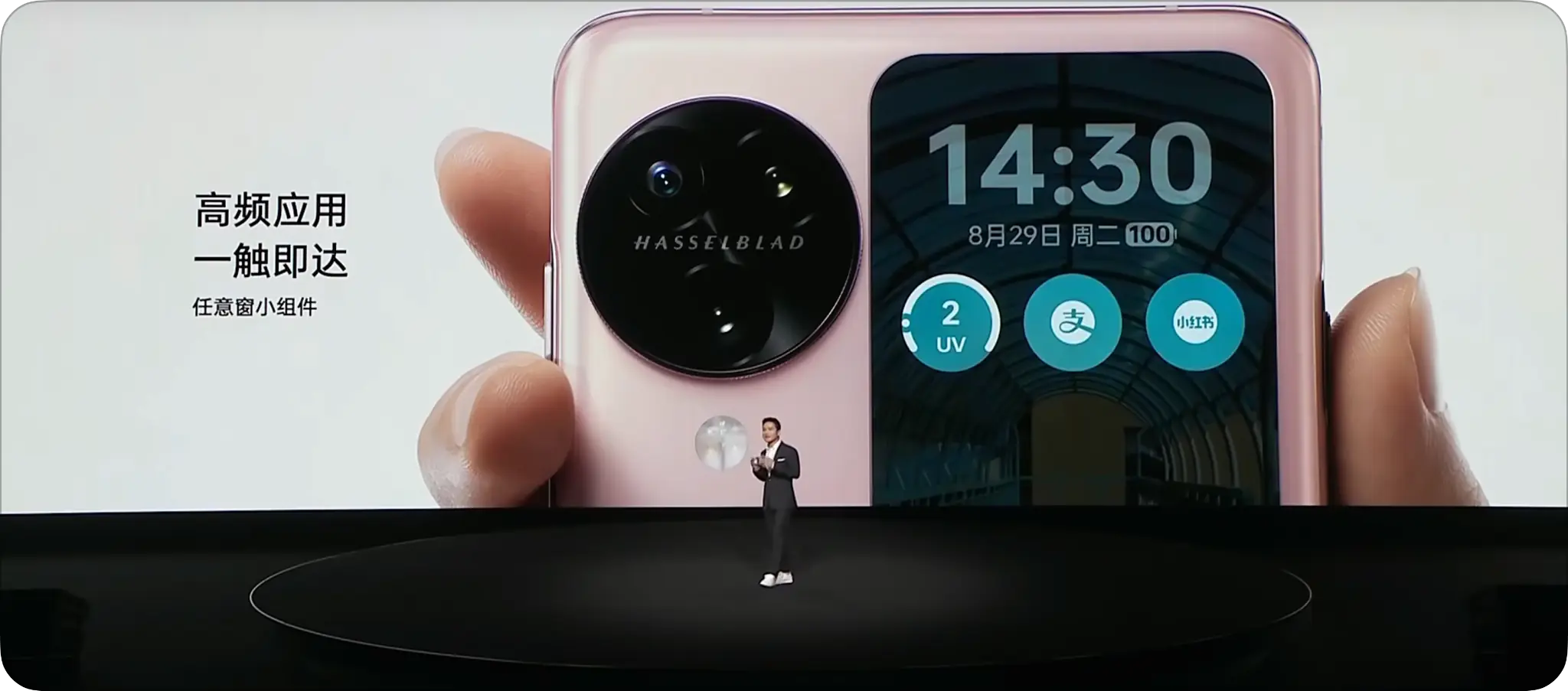
Featured at launch
Apps, widgets, and personalization became part of the public product story.
#1 most-liked feature
Based on a company study of 1,000+ mainland China device owners one month after launch.
#2 purchase driver
The overall cover-screen experience ranked second among key purchase drivers.
Company-level “Ultimate Experience Award”
Awarded to the cross-functional Find N3 Flip cover-screen team.
The study covered all software and hardware features of the device. “Overall cover-screen experience” includes Home, apps, components, notifications, personalization, and the combined hardware–software experience.
10 / My contribution & reflection
A new device form needs a new system—not merely a new canvas.
- Reframing “add more cards” as “build an extensible cover-screen system”
- Proposing the framework and defining five responsibility-based spaces
- Leading core interactions and key trade-offs
- Coordinating 15+ teams responsible for lock-screen widgets through design, development, and launch
- Choosing apps rather than cards as the primary content model
- Product strategy, priorities, and launch scope
- The visual designer authored the component specification; visual, motion, and app teams delivered individual solutions
- Engineering, integration testing, launch, and post-launch research
Extensibility is not the number of entrances a product can add. It begins with an experience grammar that teams can share and people can reliably predict.