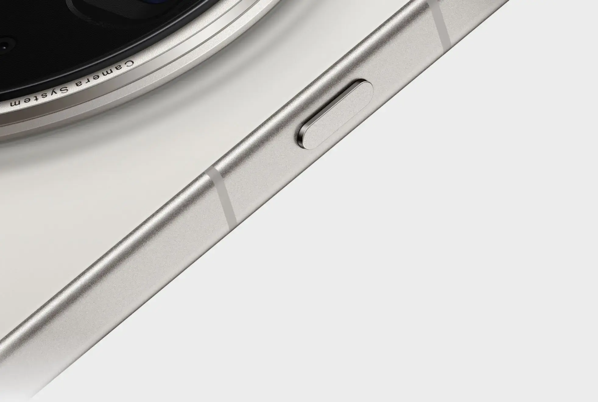
Physical button
Short pressLong press
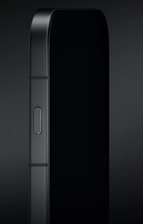
Case 03 · OPPO Find X Series Shortcut Button · Core design & launch Nov 2024—Jun 2025
As software experience design lead, I defined the short-press and long-press rules, state feedback, and setup journey from the ground up across 5 behavior categories × 5 context groups and 10 functional modules. Once the response model was stable, I reframed the next challenge around when people would first understand and configure the button.
01 / Challenge
If 10 functional modules defined short press, long press, and feedback independently, the same action could produce contradictory outcomes while the screen was off, the device was locked, an app was open, or a task was running. The work first had to answer how the system should respond, then whether people would discover the button and complete setup. Cross-checking exposed 14 experience risks, most involving comprehension and state awareness.
Across 5 behavior categories and 5 context groups, when should an action execute, adapt, wait, or be blocked?
How should short press and long press remain predictable? Double press was not part of the model.
How should the system communicate the outcome, current state, and expectation for another press?
02 / Method
I synthesised and applied a four-step hardware–software method to avoid defining the experience from one screen or idealised context.
Rule model
Across 10 integrated functional modules
Consistency does not mean identical feedback everywhere. It means a predictable relationship between intent, state, and outcome.
03 / A rule in practice
The full specification defined both short press and long press and cross-checked behaviors against contexts. Switching the device sound state shows how feedback can make a change perceptible without interrupting the current task.
Confirm execution through clear visual, haptic, or audio feedback.
People should know whether a function is active, a task is running, and what another press will do.
Responses may change by system state, but the same intent cannot produce contradictory outcomes.
Change the device sound state without leaving the current task.
When the device is in Ring mode, a long press switches it to Vibrate or Silent.
An OPPO Fluid Cloud status capsule shows the result, reinforced by haptic feedback.
The outcome is immediately perceptible without a full-screen interruption.
Representative rule: switching the device sound state.
04–05 / Iterations
Iteration 01 · State visibility
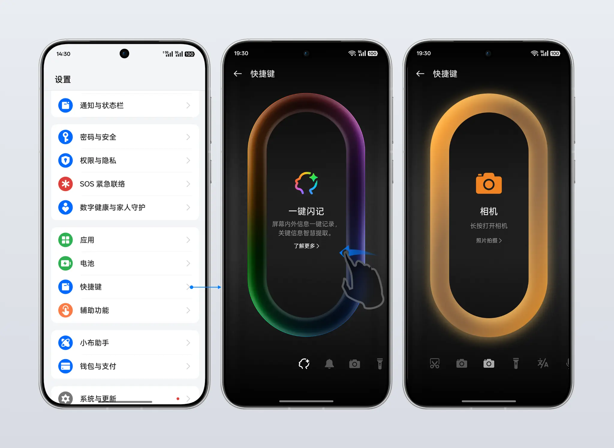
The first version applied One-Tap Notes immediately when Settings opened, while horizontal swiping changed the function. In a test with 10+ primarily younger participants—configure a function on a new phone, then trigger it in any context—roughly half verbally reported that they did not know setup had already succeeded.
When an interaction changes system state, state visibility matters more than pattern familiarity.
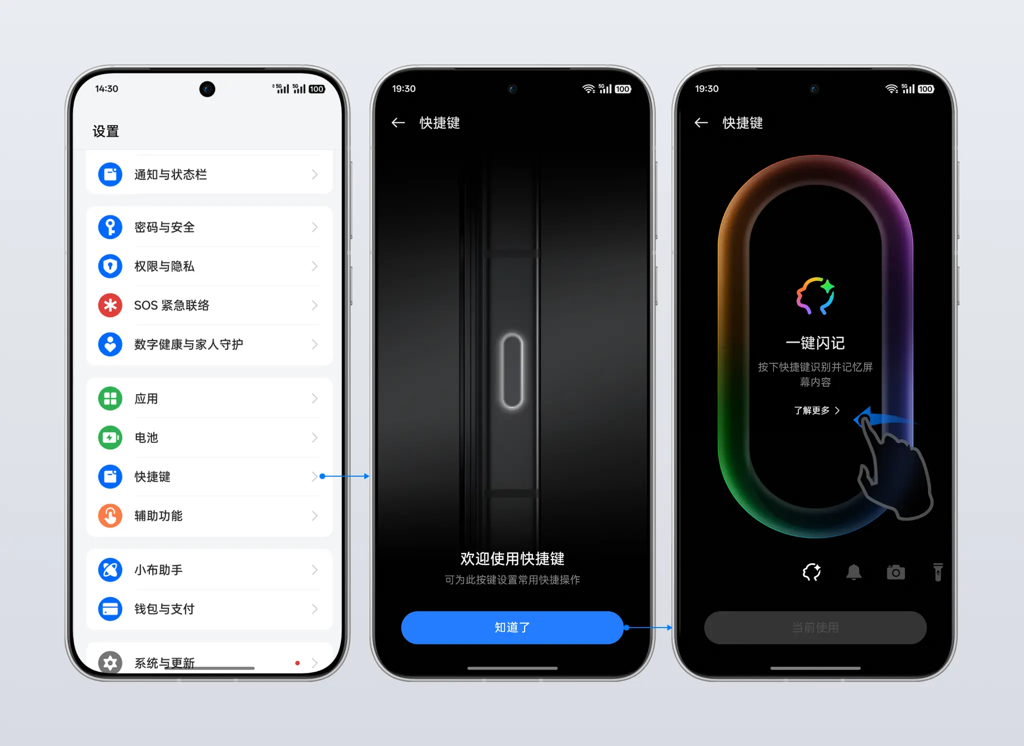
Iteration 02 · Feature discovery
Version 2 launched in Feb 2025 with an explanation, explicit confirmation, and visible current selection. Production data and usage observation showed One-Tap Notes at 20.5% among configured-button users, while many people still discovered the feature through an accidental or exploratory first press.
A first-press prompt only explains after discovery, while Settings assumes prior awareness. Neither builds an expectation when people first learn the device.
06 / Final direction
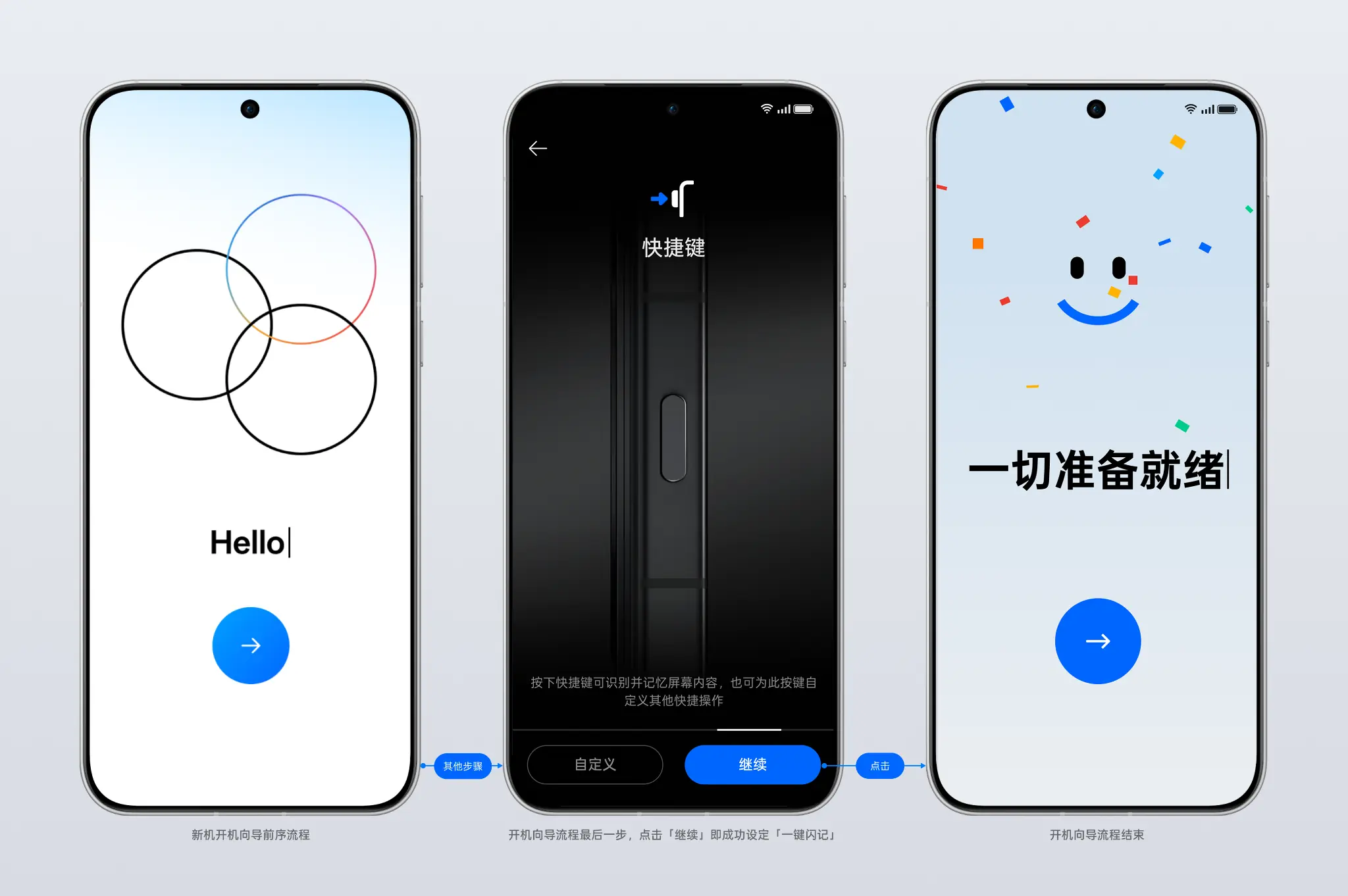
The final solution launched in Jun 2025 and moved introduction and setup to the last stage of device onboarding. Continue automatically assigned One-Tap Notes; Customize remained visible at the same hierarchy. The step could not be skipped, but people could go back. Instead of refining Settings again, the design connected button introduction, function choice, and setup confirmation within the moment people first learned the device.
Explain the control while the device is first being learned.
Offer a recommended path inside a required step while keeping Customize at the same hierarchy.
Provide clear completion feedback so people know the device is ready.
07 / Production outcome
After the final solution shipped, production data from new-user cohorts on the same handset model, drawn from different sales periods, showed a substantial increase in One-Tap Notes among users who configured any button function.
Metric scope: new users of the same handset model across different sales periods; the measure is One-Tap Notes share among users who configured any shortcut-button function. In the final version, Continue completed the recommended setup, so the result reflects the post-guidance configuration outcome.
08 / Reflection
A single ideal context cannot represent the real complexity of a physical control.
A mature pattern cannot replace understanding the product’s own context and feedback needs.
When a local screen cannot achieve the objective, find the right moment for the decision.
For a physical button, correct response rules are only the starting point. A complete experience also helps people understand it, choose it, and confirm it is ready before first use.