Starting point
#7Same-dimension satisfaction studyCase 01 · ColorOS 15 Flux Themes 1.0 · Dec 2023—Jun 2024
Turning three fragmented settings flows into a personalization system built to grow.
As the UX design lead for ColorOS personalization, I owned problem framing, experience strategy, framework outcomes, key trade-offs, and usability validation. Working laterally across product, user research, engineering, UX/UI, motion, and creative design, I helped bring the Always-On Display, Lock Screen, and Home Screen into one creation flow and establish a reusable template and resource system.
- Project role
- UX Design Lead, Personalization
- Timeline
- Dec 2023—Jun 2024
- I led
- Problem framing · Experience strategy · Framework outcomes · Key decisions · Validation
- Partners
- Product · User research · Engineering · UX/UI · Motion · Creative design (lateral collaboration)
- Scope
- Always-On Display · Lock Screen · Home Screen · Editing framework · Content system
- Version owned
- Flux Themes 1.0 · Shipped with ColorOS 15
Case chapters
Current chapterOverview01 / 08⌄
01 / Outcome
Rebuilding personalization from a seventh-place satisfaction baseline.
Flux Themes 1.0 shipped with ColorOS 15 and was presented at ODC 2024. In annual user-satisfaction studies conducted before project kickoff and after the ColorOS 15 launch, ColorOS personalization moved from seventh to first.
Validation
4.6/5Round-two composite scorePost-launch
#1Same-scope satisfaction studyBoth studies were conducted about one month after the relevant year’s new product launch: the earlier study established the business baseline at project kickoff, while the later study evaluated ColorOS 15 after launch. Both used the same user-satisfaction dimension, market scope, and comparison set, so the results are directly comparable. The post-launch study was conducted by OPPO Consumer Insights with GfK China. The result reflects the combined product and team effort.
02 / Challenge & evidence
A seventh-place satisfaction ranking pointed to a system problem.
A personalization experience has to do more than look good. People need to discover what is possible, understand the effect of an edit, and move from intent to a finished result without learning the product’s internal structure. At the start, the Always-On Display, Lock Screen, and Home Screen lived in separate flows with content distributed across different entry points.
Three findings reframed the work
This was not a single-screen problem
The kickoff study focused on mainland China and the latest flagship operating systems from leading brands. Personalization ranked seventh on user satisfaction, so a local visual refresh would leave the underlying model unchanged.
Feedback pointed to three layers
I hierarchically classified 1.7K+ reports from the year before kickoff across in-device feedback, the customer-service hotline, and social platforms, then converged them into framework, layout, and resource issues.
People wanted different kinds of control
Because the schedule was compressed, we reused an annual research workshop with 10+ primarily younger participants. Four segments were distilled into two needs: reach a polished result quickly, or continue refining it as self-expression.
03 / Reframe
One experience spine, three design levers.
I synthesized user evidence, competitive patterns, and business goals into one system proposition, then organized the work around three connected levers.
Create once, then carry a coherent expression across the system.
System logic
How one system turns expressive intent into a cross-surface result.
The system starts with what people want to express, supports creation in one flow, then uses templates, resources, and quality guardrails to carry the result across three surfaces.Express individuality
Reach a complete result quickly or continue refining it
One entry · Continuous preview · Cross-surface apply
Fast path: Choose a template → Preview and applyDeep path: Choose a template → Adjust resources → Preview and apply
Templates & layouts
One standard + three expressive directions
Composable resources
Type · Clocks · Color · Materials
Quality guardrails
Compatible type · Clock placement · Legibility
System outcome01Always-On 02Lock Screen 03Home Screen
Validation loopUsability and post-launch signals keep calibrating entry points, templates, and resources.
04 / Three key decisions
A scalable system, grounded in one clear mental model.
Decision 01 · Framework
Create once, apply across three surfaces.
The previous experience asked people to edit the Always-On Display, Lock Screen, and Home Screen independently. Resources were scattered, and there was no reliable preview of the final composition.
Decision
I led the move to a unified editing framework: people could compose and preview all three surfaces in one flow.
Trade-off
We rejected a partial model that connected only two surfaces and ruled out simply refining the three existing editors. The unified model required more design and technical coordination, but created one stable place for the experience to grow.
Before
Three separate editors
- Always-On
- Lock Screen
- Home Screen
After
One creation flow
- Create once
- Preview together
- Apply across surfaces
Decision 02 · Layouts
Use templates as a starting point, not an endpoint.
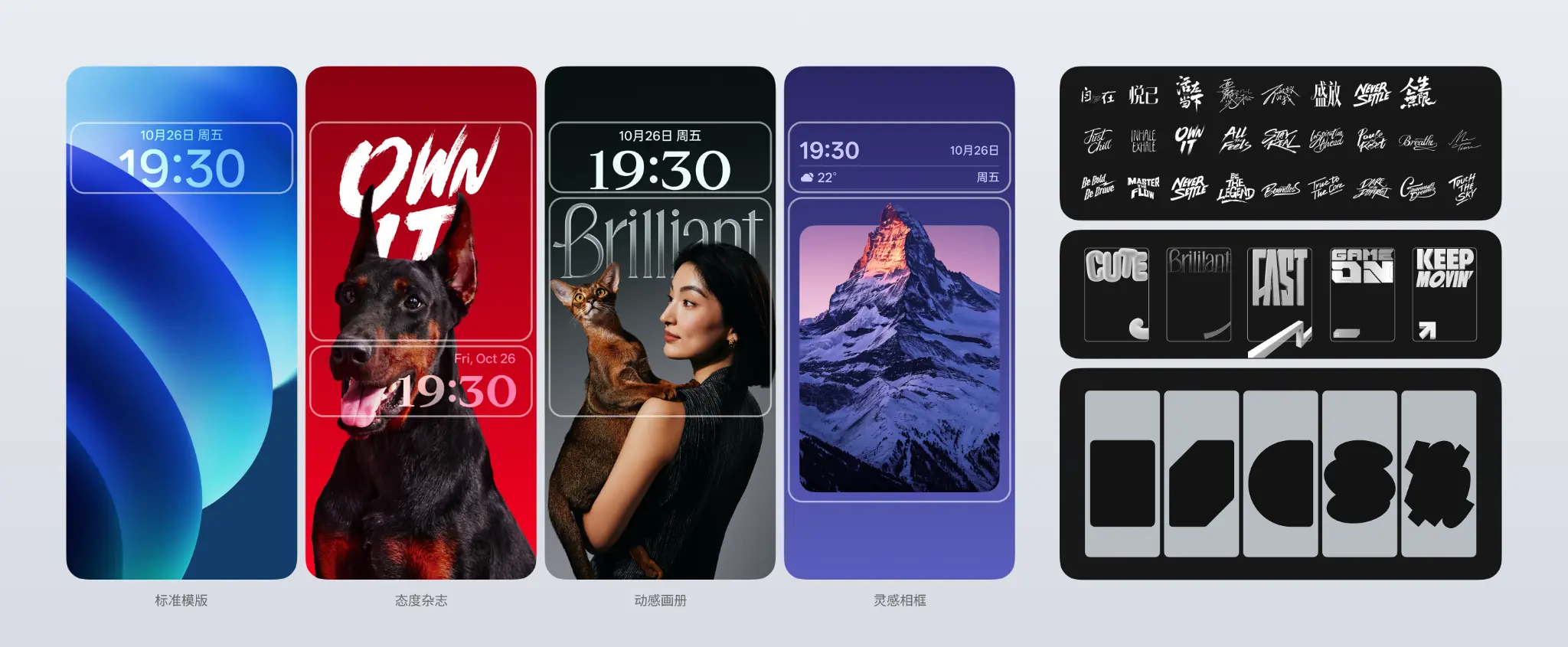
A single default layout lacked expressive range, while a fully open editor would disrupt the Lock Screen framework and produce unpredictable outcomes. We also considered a large-clock template, but its framework impact and delivery cost made it unsuitable for launch. I drove the final scope toward one standard template plus three expressive directions, balancing competitive value, user-scenario value, and engineering effort.
Each template produced a complete result first, then progressively exposed type, imagery, masks, and depth. It established a dependable starting point between speed, quality, and freedom.
Decision 03 · Resources
Build a content system, not a catalogue of skins.
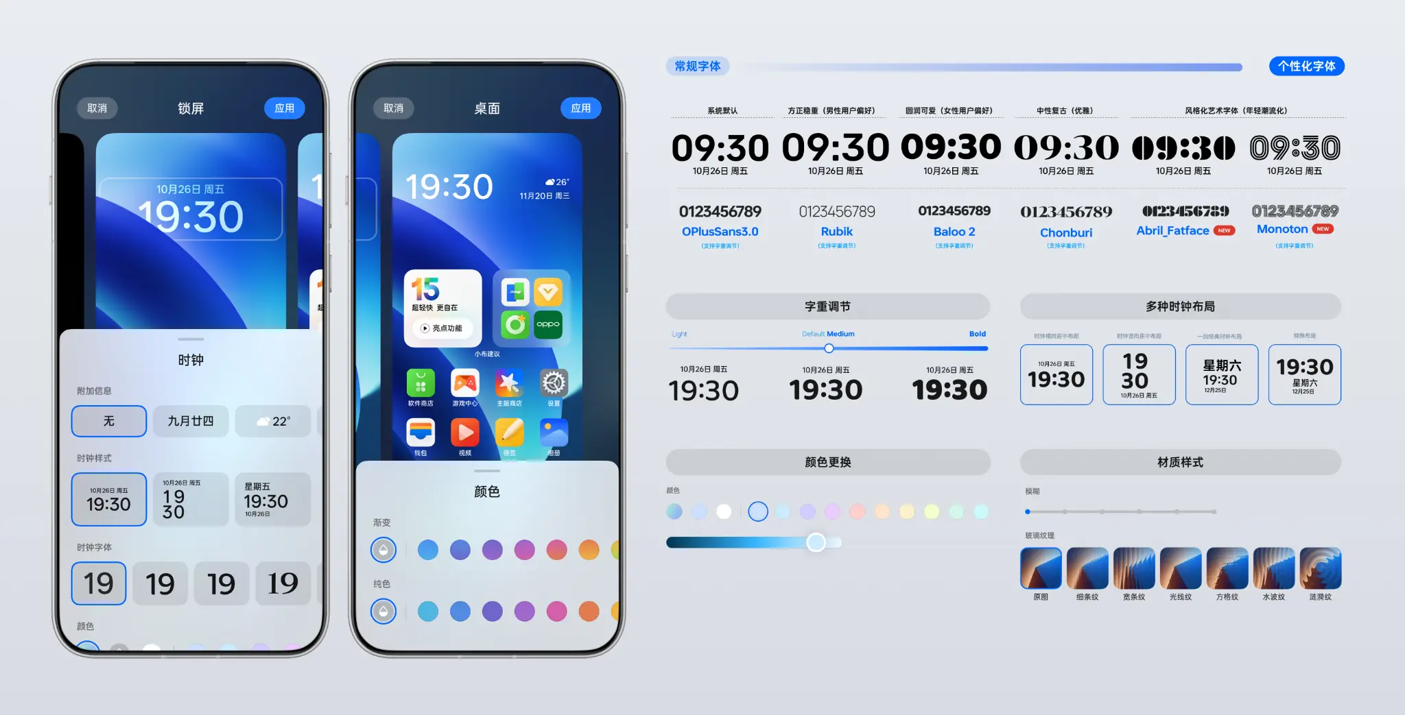
I combined a horizontal analysis of editable dimensions in leading products with user-feedback patterns, then narrowed the system to composable controls for type and weight, clock style and placement, color, and materials.
Freedom required a quality floor: each template exposed compatible typefaces, clock placement was constrained to left, center, and right, and color and material changes remained subordinate to hierarchy and legibility.
05 / Validation
The most important fix was architectural.
The first round involved 10+ primarily younger participants and surfaced more than 20 issues. Over half struggled both to discover a new template and to apply it. We moved templates to the personalization home, reducing the path from arrival there to successful application from three steps to one. A second round also involved 10+ primarily younger participants.
Before
- 01Open personalization home
- 02Find the template entry
- 03Choose and apply
After
- 01Choose and apply on the personalization home
4.6/5 is a composite of discoverability, ease of use, and comprehension. The two rounds validated improvements to template discovery and application.
06 / Shipped experience
A coherent system, many voices.
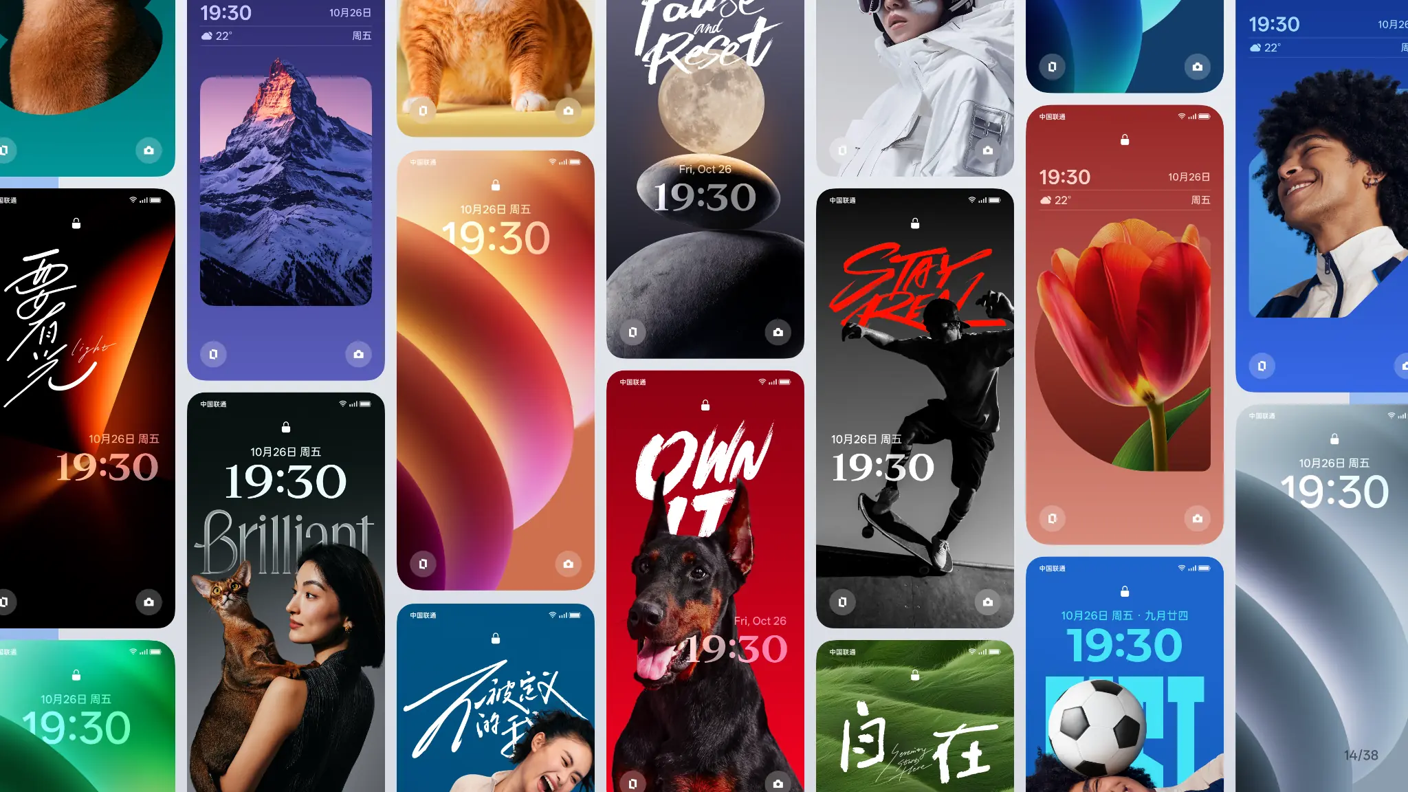
Flux Themes 1.0 was not a fixed visual style. It was designed to support different content, tastes, and levels of expressive intent. Portraits, pets, nature, sport, typography, and abstract imagery show that system consistency does not require visual sameness.
07 / Launch & impact
From system model to shipped experience.
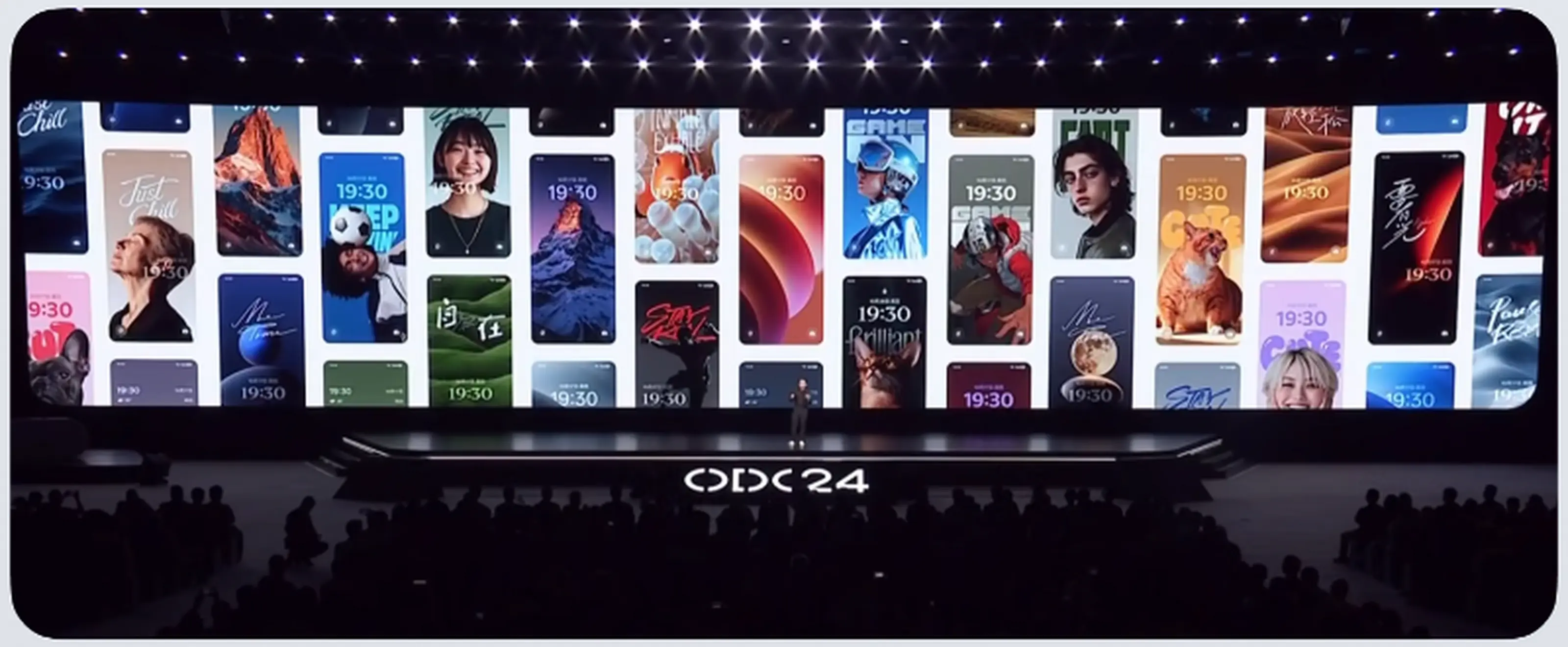
Flux Themes 1.0 shipped with ColorOS 15 and was presented during the ColorOS 15 keynote at ODC 2024. The unified framework, layered templates, and composable resources reached production as one experience.
Product
Shipped with ColorOS 15
The unified framework, templates, and content system reached production together.Users
#1 in that Android benchmark
From a post-launch, device-wide satisfaction study jointly conducted by OPPO Consumer Insights and GfK China.Team
2024 team recognition
The project team received an internal award for high-impact delivery.08 / Leadership & reflection
Aligning scope, quality, and time without management authority.
I led through lateral influence rather than line-management authority. When engineering requested a smaller scope because many design details were still being resolved, I worked with the team to stage delivery by device form.
Business framing
Turn feedback into a decision structure
I personally classified 1.7K+ reports and turned scattered complaints into three executable decision areas: framework, layouts, and resources.System thinking
Prioritise 19 capabilities with three criteria
We separated launch, later, and out-of-scope items by competitive value, user-scenario value, and engineering effort.Delivery leadership
Protect the core through staged delivery
We shipped the slab-phone experience first, with large-foldable and tablet support delivered in later phases.If I started again
I would define behavioural metrics before launch—including new-template discovery, editing completion, and template-switching frequency—so evaluation would extend beyond usability testing and periodic satisfaction studies.
My role and the team